Tuesday, 23 June 2015

Ease In/Pendulum

More motion studies dealing with how we can trick the eye to give a sense of physical realism in terms of gravity etc using frame distance to give a sense of 'speed'.

Pendulum:


Ease in - Ease out:


I find it interesting how just the adjustment of distance apart per frame can give a sense of accleration or slowing down.

Monday, 15 June 2015

Final Pose

After all the phases, it was time for me to create my final pose. My final pose was selected from one of the five that I created and taken to a 'new level'. For this I decided to add colour, but also add the character into a scene. This scene in my mind had to give credence to the back story of the character as well. As such I chose to create a 'dojo' scene.

Colour Pose


This was the pose I selected from my list, mainly for the flow of action and expression. I also rendered the clothing and added colour to this final pose to give it a more animated and animation feel. the Skintone colour I found online via google. This allowed me to colour pick a reasonably nice skin tone inside Photoshop.

Final Pose with Scene


My final pose with the scene I painted. This scene is meant to represent a dojo or martial arts gym which he practices in. I also added the shadow to give him a sense of 'grounding' within the image, as he is a cutout from another file.

I am overall very happy with the final result!

Character turn around

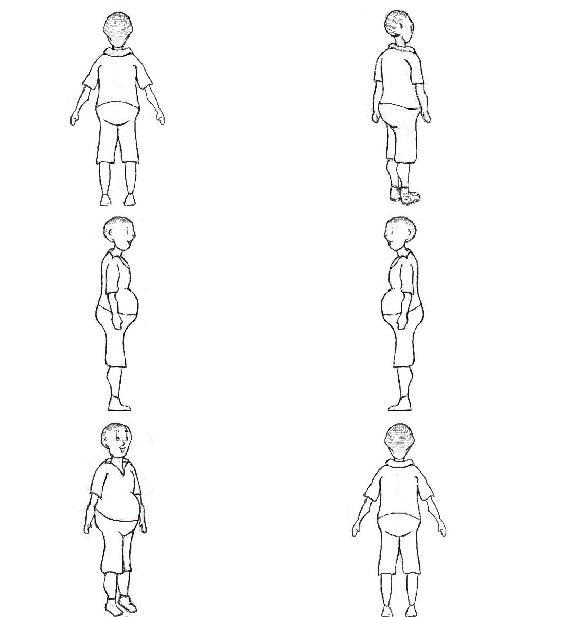
Well, this has been the hardest thing for me so far in Animation. The turn around's really started to do my head in, in particular the 3/4 turns. I think in general however I managed to figure them out fairly well. My character really feels like it is coming to life. I actually had begun my Turn around before my poses, but I did not finish my turn around until after my poses, majorly due to the nature of getting it as accurate as possible!

Kung Fu Panda was my main influence for my poses, but also my character's physical features.


Turn around Sheet
Final Turn around Animated

Poses Sheet


I was really unsure how to pose my character, so I searched some martal art poses, and found this useful image from Mavinga.com. These became my resource, however I still had to compete with the fact my character is not your 'average' martial artists, but rather a rather fat one. Because of this I had to do a lot of trial and error sketches underneath the character to which I later removed.


Reference Images


My final poses
Overall I was very happy with the final pose, I get a feeling of flow and movement from my character and I believe overall I worked out the intricacies of these poses with his belly being the major defining factor.

Tuesday, 28 April 2015

Assignment One - Height and Body Design

Now that I have achieved the face that I want, it was time to turn my attention to the height, which unfortunately caused me some grief!

Height Chart


I decided to go with a 6 head design, as 7 seemed far to lanky and disproportionate, and 4 seemed far to childish in design.

I also worked after that on looking at the angle of the body or "posture". This changed somewhat later on as I found that for his back story having such a shockingly bad posture made little to no sense.

Silhouette
At the end of that class, I had some spare time to work on some silhouettes, which gave me a more fair idea of how I wanted my character to look and move. This helped me exponentially with deciding that my original posture was terrible! 


Assignment One - Emotion Sheet

So, Its been a bit too long since I last updated this blog, so bare with me!
Assignment one has been very interesting, using concepts that I have learned in my classes to create my own specific character design.

One of the first requirements was to create an emotion sheet for our little characters. Originally I had designed another face to use, but decided against using it as it didn't appeal to me or my background in which I wanted to go with for the character.

Emotion Sheet


Overall I am happy with the design - It is as I imagined it, I also think the emotions are obvious enough to most people as to what expression is being posed.

I obviously need to work on my line art, as it is fairly messy!

Monday, 2 March 2015

Attack on Titan - Shingeki no Kyojin


Possibly one of my favourite anime's of all time, is the series called Attack on Titan. It is a Japanese show based on giant Titans who attack the last stronghold of man. It is based on a Manga / Comic series.

  • The first episode debuted April 6, 2013.
  • The Manga was written by Hajime Isayama, the Anime series was created by Tetsuro Araki
  • The Studio was called Wit Studio Production I.G
  • Won the Kondansha Manga Award in 2011. 
    • Was nominated for the  4th annual Manga Taisho award
    • Second highest selling Manga series of 2013
    • 30 million volumes sold
    • The Anime series won during the Newtype Anime Awards - Best script, Best director, Best soundtrack, Best theme song, top female character and Title of the Year.
    • It received the award of best TV animation at the 2013 Animation Kobe Awards.
  • The Colours and style are bold and intense, there is a lot of technical drawing, particularly background scenes. Nothing is simple about the style, yet the style is beautifully done, and really encaptures you into the scene and story. The animations are smooth, and unique, no one animation is overplayed, and each titan has its own 'personality' as such.
  • The dark side of Attack on Titan appeals to me, plus the amazing visuals, story line and plot. The animations are so smooth and the background painting is so effortlessly done, it really adds to the vibe and feel of the show. The soundtrack and audio for the series is superb and fits really well within the show's theme.